Monday, September 28, 2009

Poster roster.

It seems as though - even if I set aside a time to do things - I wait until it's late or until I should be doing something else. Posting right now is fulfilling both. It's late and I have a couple of other blogs that I wanted to write tonight. I just spent the evening doodling. C'est la vie and all that.

I was thinking about poster ideas and how I wanted to go about doing things when it comes to doing this project. My main inspiration is Derek Hess. In a nutshell, he started out doing flyers for his mate's bands and that progressed to posters. From there, he's done album work, magazine covers, calendars and what he doesn't use on an item, he sells as is.


This flyer is one of his most recent ones and it was done in 2008.


This is one of my favourite flyers. I work in pen, so my lines are visible. All of them. Derek Hess' style encourages me in that a style similar to mine can be used and accepted in a wider community.


I included this one as I like the way he has almost pieced together two completely different things and made them one. The mite's legs and jaws with the skull's upper structure. Drawing the unreal in a way that makes it seem almost possible.

But onto his posters. I wanted to get some ideas as to what I could do with my poster. I thought of creating a band or gig poster promoting the band that my dad was in through college. 'Nolo Episcopari'. It's latin. For 'I do not wish to be a bishop'. That's where I get it from...


This is his most recent gig poster. It was completed this year. One thing that interests me is his use of different media. His work - whether in ink or not, is always enhanced when he puts a bit of colour behind it. Even if it is just a splash or brush stroke. The beauty of doing this in photoshop is that I can Cmd+Z if anything goes awry.


The thing I like about these two is that they both have combinations of things that wouldn't go together. The body with the gramophone cone as an ear, the cicada nymph on a pumpkin surrounded by Snoopy characters. I like that - in the second poster - he has used his black lines as shading as opposed to using a darker colour in the shaded parts.

And one for luck.


This is just one of his pieces that I really like. It's using his loose style, it's using mixed media, it's using superimposed characters. I think it's an amazing mix that comes together nicely.

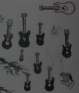
And for my doodle, this is one of my pieces for the 'Alternative Representation' project:


Friday, September 11, 2009

Logo a go-go.

The first steps to creating a logo is to draw as many small pictures as possible.  Profound.  It's news to me, anyway - I've honestly never really given it that much thought before.  I'm learning already, folks.

Here's the first page of little ideas:


The ideas ranged from everything between prayer and food, sleep and music.

Refining the ideas like the amateur goldsmith I am, I reduced the jumble of doodles to a well seasoned selection, before mixing them back up in twos and seeing what I got.  One such combination grabbed my attention in a way that if it were a person, I'd say "Hang on, mate.  Do that again."


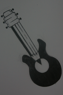
The winning combination was of a pencil and a guitar.  After I had found them, I proceeded to work and rework the image until I had a blend that was silky smooth.  Also included above are the fringes of another design and a head with nothing but a big mouth.  That's how I roll.


The finished idea is here.  I used the negative space in the guitar to highlight the graphite in the pencil.  I elongated the eraser and the eraser holder to show the head of the guitar and I used the lines of the side of the pencil to show the strings (I know - there aren't enough).

I'm very happy with how it turned out.  I'm made happier with the knowledge that it's not going to be my best work.

Now all I have to do is create this logo in Adobe Illustrator...

Bonus game - the drawing from a previous project is in one of these pictures.  Can you find it?

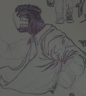
And a doodle.

Saturday, August 29, 2009

And here's me thinking Gestalt is a bloke...

It turns out that, like a lot of quirky foreign words that we can't quite translate (or don't want to), we have simply added the word we like as is.  Albeit with a different pronunciation.

'Gestalt' (short for Gestaltqualität) describes the configuration or pattern of elements so unified as a whole that its properties cannot be derived from a simple summation of its parts.  (Thank you, Dictionary).


In a nutshell, it means that we see the picture before we start to break it down into dots and lines and whatever else it is made of.  Like the dalmatian, for example.  We see the overall picture but only after looking at it for a while, we see that it's a mess of dots.  Glancing at it for a second is the best way to identify what it is.

A short post, for now.  I shall be back to talk about logo ideas and scrawlings in a short while.


Doodle.

Wednesday, August 26, 2009

Take two.

Simplifying pictures, it turns out, is not as simple as it would have us believe.  Which parts to leave out, which parts to add more to.  Let's see how little old me got on, shall we?

First of all, here is my original idea for 'Socially Significant'.  There was a food and drink festival in my town and I was part of a small contingent who were asked to re-create this logo on the beach in 2 metre-tall letters.  A photograph was taken and the logo was incorporated into the banner for the festival.  I went to the festival with my brother because we got given VIP passes to the event.  It was average at best.

Before:


After:


Quite a big change.  I cut out a lot of noise and went from three messy, nondescript panels to two more noticeable sections.  A picture of me and the logo --->  A picture of the picture of the logo on the banner.  It makes perfect sense...

Bonus picture of the logo itself:


My second one was not really in need of changing, I thought.  It was simple enough.  Being a geek, I asked someone to teach me how to do a Rubik's cube for my 21st.

"Dan," I hear you say, "how do fight off the waves upon waves of girls who are so eager to know someone with such a skill?"

Fortunately, 'Impressive Outcome' doesn't necessarily have to also be 'Socially Significant", so I dodged a bullet there.

I digress.

I was seeing how fast I could do it and one minute and eighteen seconds was my best time.

Thank you.  Thank you.  I'm here 'til May.


And finally, my first piece.  'Positive Consumer Experience'.

Basically, a Moleskine sketchbook was cheaper than I thought it was.

Before:


After:


If you've never had a Moleskine, get one now.  Right now.

Doodles.


A few  more things to note:

Go and see District 9.  It's everything you can want in a film.

Go and see Inglourious Basterds.  QT is always brilliant.  Go for the guns and the blood, stay for the acting and the script.

That is all.

Saturday, August 22, 2009

Semiwhatics?


Sometimes it's nice to use words that make us seem smart.  More so when you're an artist.  Plus, now I can apply my new phrases to everyday life, should I so choose.

  If someone's house is on fire, it denotes that their things are burning.  If they talk further and explain why it was a bad thing, they would connote that the things that are burning have different meanings to them.
  A symbol of the fire would be the smoke.  It's a connection that we've made through simply observing it.  To put it out, we'd look for an extinguisher.  That would have an icon that represents fire, so we know what it's for.
  The object of the fire would be the flames.  The Representamen would be the light being emitted from it.  The Interpretant would be that the things it touches are going to be damaged and if it touched a person, they will come to harm and I don't know what I'm talking about any more.


These are sable.  Or sables.  I don't know the plural.  Is it like fish/fish or chicken/chickens? 
 Who knows.  The one at the top is the one we paint with.  The one at the bottom is not.  The 
more you know...


Drawing in class opened my mind a bit.  Well, it made me think a bit more about simplifying things, anyway.  I have to snap out of my doodling mindset, I think.  I'm scared, but it's how I'm going to learn.  My doodles are going to be used, but for now I need to think of silhouettes and basic shapes and things.  It's always weird to use new tools and techniques, too.  I've been drawing with a biro for the past 6 years or so.  Such is my wont.  It's going to be good to use ink with a brush.  Or even pencils.


Wednesday, August 19, 2009

Test Post.


Fighting through the unrelenting heat, Dan made a post. There was much merriment.